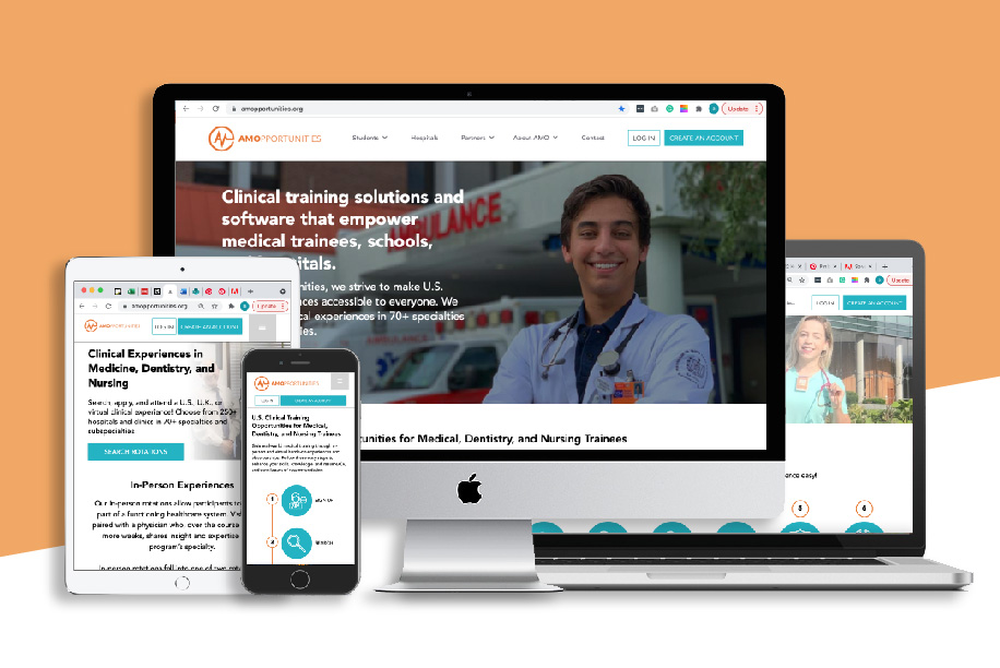
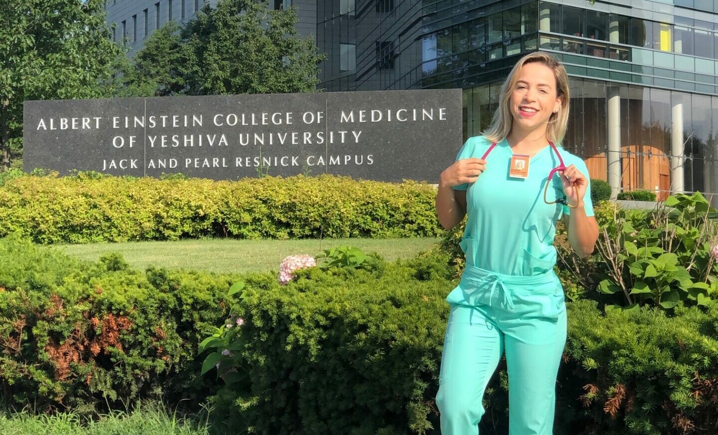
If you’ve visited our website recently, you may have noticed a few changes. First, you’re greeted with the beaming smile of AMO Ambassador Rafael. Next, you may notice a more minimal navigation bar, and, finally, some sleeker design elements. However, there’s more to our redesign than meets the eye! We’ve taken measures to create an easier user experience, build in new content, and develop a more straightforward organization.
Now the experience of our website matches the quality of our clinical sites. Read more about some of the new features and navigation below, and say hello to a new AMO!
The Navigation Bar

Our new navigation bar is simpler and easier to, well, navigate. But don’t be fooled by its simplicity! Inside each of the tabs is a pocket of information that helps you to access the resources you need. Whether you’re a student searching for a U.S. clinical rotation, a hospital or school looking for information about our partnership process, or a job-seeker looking to join our diverse and growing team, our navigation bar will help you to the information you need with efficiency.
The Student Tab and Reviews Page

Under the “Students” drop down menu in the navigation bar, you’ll find a handful of resources to help introduce you to AMO and how our rotations work and some frequently asked questions. The new “Programs” page elaborates on the different types of experiences AMO offers. Check out a detailed breakdown of both in-person rotations and virtual rotations, as well as some highlighted programs for each experience type.
Another exciting change under the student’s tab is our new “Reviews” page. Here you will be able to read over 800 reviews from previous AMO visitors and be can browse reviews in specific categories, such as our top programs, most visited cities and most popular specialties. If you find yourself awestruck by one of these reviews, you can browse for your own rotations using links conveniently provided directly on the Reviews page.
Beyond written program reviews, our Reviews page also includes easy to read visitor statistic breakdowns as well as video testimonials that include footage of our visitors in action.
The Partners Tab

AMOpportunities is able to provide students clinical rotation experiences through its partnerships with hospitals. Hospitals have access to a pool of potential applicants through our partnerships with universities around the world and through our relationship with agencies, student organizations, and more.
Whether you are a hospital administrator, a physician interesting in becoming a preceptor, a dean, or part of an agency or organization, our website’s new partnerships tab has information about our partnerships process and the reciprocal benefits an AMO partnership has for your institution.
About AMO

We saved a little corner of the new website that’s all about us, and we’ll be honest, we’re pretty excited about it! The “About AMO” tab has a lot of features that help us introduce ourselves and provide you with resources to learn about AMO as an organization. Learn about the AMO story or meet our team. Meanwhile, the “Blog” page takes you to The Daily Checkup, AMO’s blog that you already know and love (and where you’re reading this!).
A new addition to the “About AMO” section of our website is our dedicated careers page. This page is where you can find all of our available positions and apply. However, our career page also offers a deeper dive into our team demographics, our company culture, and our benefits. Transparency is at the center of what we do, and that starts on our careers page.
Our Press page is also located under the “About AMO” tab.
Keep an Eye Out
While these new changes are exciting, we’re not quite done yet! In the coming weeks, we have a few more additions planned for our new website. We will be revamping our Press page to be easier to navigate and offer more information. We are also creating a page dedicated to make our DEI initiatives more transparent and accessible.
Say hello to a new AMO at amopportunities.org.


Leave A Comment